
On March 11, 2026, Cursor published a blog post titled "How we compare model quality in Cursor." It was understated. No dramatic claims. No shots fired at competitors. Just five charts and a calm explanation of their internal eval process.
The AI community mostly filed it under "company talks about their benchmark." That was a mistake. Those five charts, read carefully, expose five assumptions baked into every public coding benchmark that nobody is questioning. Each assumption, once you see it, cannot be unseen.
Here is what Cursor showed. And here is what they did not say out loud.
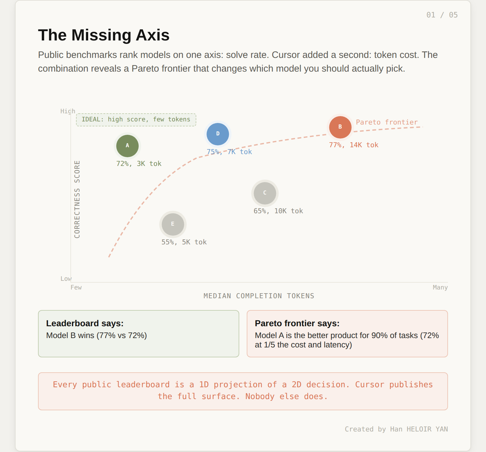
The first chart in Cursor's post plots CursorBench correctness scores against median completion tokens per model. A scatter plot. Simple enough.
Except no public coding benchmark publishes this view. Not SWE-bench. Not Terminal-Bench. Not Aider Polyglot. Every public leaderboard ranks models on a single axis: what percentage of tasks did the model solve? The implicit assumption is that solve rate is the metric that matters.
Cursor is saying: no. There are two axes that matter. How many tasks do you solve, and how many tokens does it cost you to solve them?
This is not an academic distinction. In production, tokens are latency. Tokens are cost. A model that solves 72% of tasks with 3,000 completion tokens is a better product than a model that solves 75% with 12,000. The first model responds in seconds. The second keeps your developer staring at a spinner for a minute. The first costs pennies per request. The second costs dollars.
Public benchmarks hide this. They report the percentage and discard the path. SWE-bench does not care whether the model solved the task in 500 tokens or 50,000. As a result, the industry optimizes for solve rate, and models become increasingly verbose to capture marginal improvements. Reasoning models are the extreme case: they solve more tasks, but they "think" for thousands of tokens to get there, and the developer feels every one of those tokens as latency.
Cursor's scatter plot reveals the Pareto frontier: the set of models where you cannot improve correctness without spending more tokens, or reduce tokens without losing correctness. That frontier is the actual decision surface for product teams. Everything below and to the left of it is dominated. Everything on it represents a real trade-off. If your current eval does not show you this frontier, you are making model selection decisions with one eye closed.
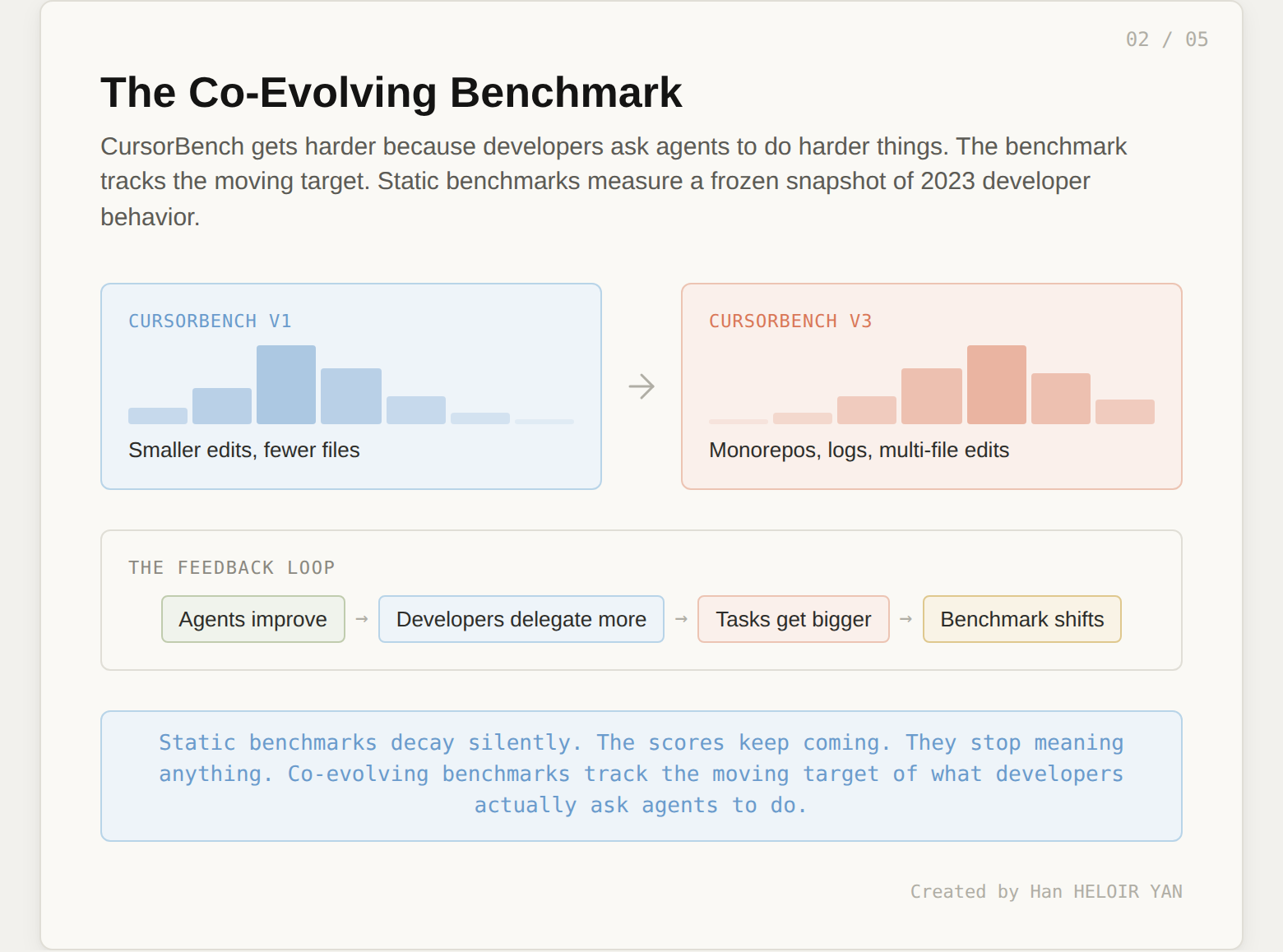
The second chart shows the distribution of edit sizes (lines of code in the gold patch) across three CursorBench versions. The distribution shifts right from v1 to v3. Problem scope has roughly doubled.

On the surface, this looks like a methodology note. "We made the benchmark harder." But the implication is more interesting than that.
CursorBench tasks are sourced from real Cursor sessions through Cursor Blame, which traces committed code back to the agent request that produced it. If the tasks are getting bigger, it means developers are asking agents to do bigger things. The benchmark is not getting harder because Cursor's research team decided to make it harder. It is getting harder because developer behavior is shifting.
This is a co-evolutionary dynamic. Developers learn what agents can handle. They delegate more. The tasks grow. The benchmark grows with them. The next version of CursorBench will be harder still, not by design but by observation.
Public benchmarks cannot do this. SWE-bench Verified is frozen at 500 tasks from 2024. SWE-bench Pro is frozen at 1,865 tasks from 2025. They measure a snapshot of what software engineering looked like when the benchmark was built. They do not track the moving target of what developers are actually asking agents to do right now.
This matters because the task distribution is the most important variable in any benchmark, and it is the one most benchmarks treat as fixed. If the distribution of real work shifts (toward longer tasks, more files, more ambiguity) and the benchmark does not shift with it, the benchmark's relevance decays silently. You keep getting scores. The scores stop meaning anything.
The third chart is a two-panel comparison. Left panel: gold patch lines of code, or LOC (how much code the solution requires). Right panel: task description length (how much text describes the problem). CursorBench is compared against SWE-bench Verified, Pro, and Multilingual.

This is the most revealing chart in the entire post, and Cursor barely comments on it.
CursorBench tasks have short descriptions and long solutions. Public benchmarks have long descriptions and short solutions. The information density is inverted.
Think about what each combination actually tests.
A long description with a short solution is an instruction-following task. The problem is precisely specified. The expected output is small. The model's job is to parse a detailed specification and produce a targeted fix. This is what SWE-bench measures. The GitHub issue describes exactly what is broken, includes a traceback, and points to the relevant code. The gold patch is often a handful of lines.
A short description with a long solution is an intent inference task. The developer says "fix the login flow" or "refactor the data pipeline." The model must figure out what that means in the context of the codebase, make architectural decisions, and produce substantial code. There is no specification to follow. There is a vague intent to resolve.
These are fundamentally different cognitive tasks. And they activate different model capabilities. A model that excels at parsing detailed instructions may fail at resolving ambiguous intent. A model that infers intent well may be sloppy when given precise specifications.
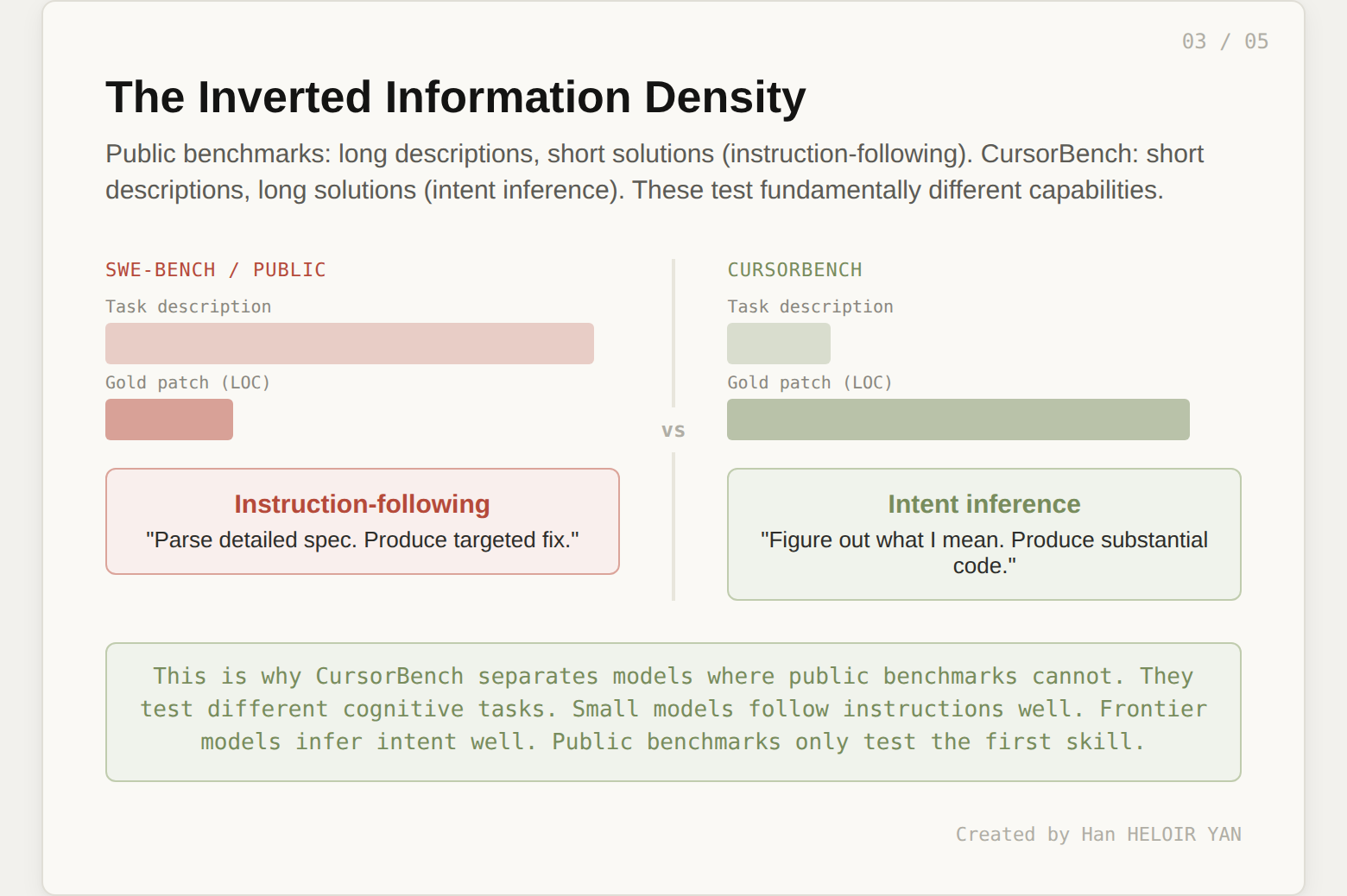
Public benchmarks test instruction-following. CursorBench tests intent inference. When Cursor reports that their benchmark separates models where public benchmarks cannot, this is why. The models are not being tested on the same skill. The small models that score well on SWE-bench are good at following instructions. They are not good at figuring out what you meant. The frontier models that barely edge ahead on SWE-bench are much better at intent inference, but the benchmark cannot see it because it never asks them to infer intent.
161 of SWE-bench Verified's 500 tasks require only one to two lines of code change. On CursorBench-3, the median solution is substantially larger and spans multiple files. You are not measuring the same thing. You were never measuring the same thing.
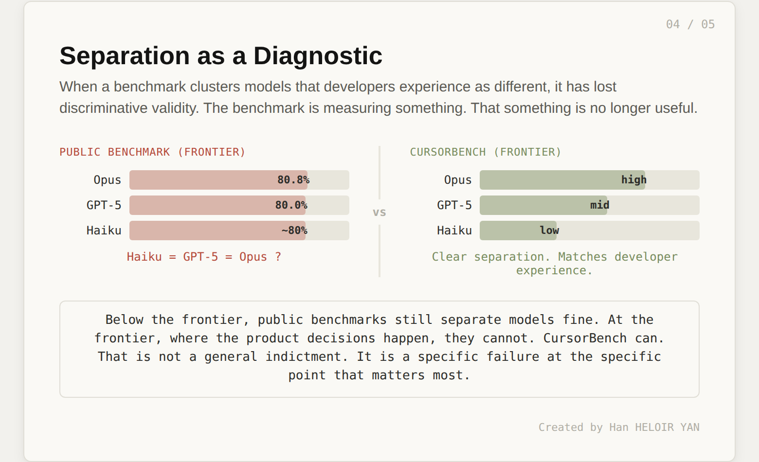
The fourth chart shows model separation: the score spread between models on CursorBench versus public benchmarks. CursorBench produces more separation at the frontier.

Most people read this as "CursorBench is harder, so scores are lower and more spread out." That is true but not interesting. The interesting reading is a diagnostic one.
When a benchmark shows wide separation between models that developers experience as meaningfully different, the benchmark has discriminative validity. It is measuring something real.
When a benchmark shows tight clustering between models that developers experience as meaningfully different (Haiku matching GPT-5, for example), the benchmark has lost discriminative validity. It is measuring something, but that something is no longer correlated with the thing you care about.
Cursor's claim is specific: on CursorBench, models that developers rate as better actually score higher. On public benchmarks, models that developers rate as better sometimes score the same or lower than models developers rate as worse.
This is not a blanket indictment of public benchmarks. It is a more precise claim. Public benchmarks lose discriminative validity at the frontier. Below the frontier (comparing a 2024 mid-tier model to a 2026 flagship), SWE-bench still separates them fine. The problem is specifically at the top, where the models that matter most for product decisions are the ones the benchmark cannot tell apart.
If you are evaluating models below the frontier, public benchmarks still work. If you are choosing between the top five models for a production coding agent, they do not.
The fifth chart shows that CursorBench rankings align more closely with online evaluation metrics than public benchmark rankings do.

This is the most important chart in the post and the one that got the least attention.
In psychometrics, construct validity asks: does your test measure what it claims to measure? A math test that actually predicts mathematical ability has construct validity. A math test where scores are determined by reading speed does not, even if it contains math problems.
Cursor is making a construct validity argument. Their offline benchmark (CursorBench) predicts their online metrics (how developers actually experience model quality in the product). Public benchmarks do not predict those same online metrics. Therefore, CursorBench has higher construct validity for the thing that matters: developer experience with coding agents.
This is the chart that should make every benchmark maintainer uncomfortable. It is not enough to build a hard test with clean data and careful grading. If your test's rankings do not predict how users experience the models in production, you are measuring something, but it is not what you think it is.
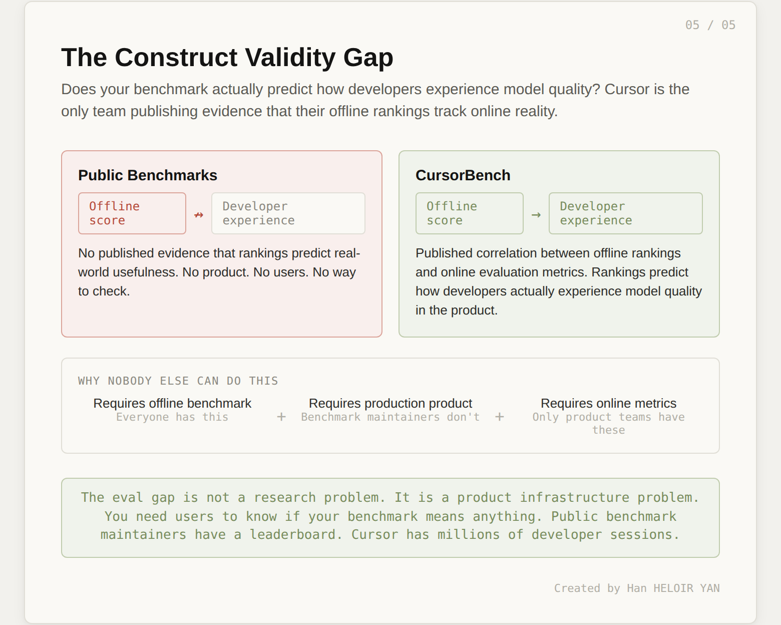
No public benchmark publishes construct validity evidence. None of them show a correlation between their rankings and any downstream measure of real-world usefulness. These benchmarks assume their scores are meaningful. Cursor is the first team to show receipts.
The reason nobody else does this is structural. To run a construct validity test, you need both an offline benchmark and an online product with real users. You need to measure developer outcomes, not just code correctness. You need the infrastructure to connect offline scores to online behavior. Public benchmark maintainers do not have this. They have a test suite and a leaderboard. They have no product, no users, and no way to check whether their rankings track reality.
This is why the eval gap is not just a research problem. It is a product infrastructure problem. The teams that can close the loop between offline scores and online outcomes will make better product decisions. The teams that cannot will keep optimizing for benchmarks that do not predict developer experience.
Cursor published five charts. They positioned them as a methodology explanation. Read differently, they are a five-part argument that the entire public coding benchmark ecosystem is measuring the wrong things: single-axis leaderboards instead of efficiency frontiers, frozen task distributions instead of co-evolving ones, instruction-following instead of intent inference, undifferentiated scores instead of discriminative rankings, and assumed validity instead of demonstrated validity.
No other team has published evidence on any of these five dimensions. That is either because nobody else has thought about it, or because nobody else has the infrastructure to measure it. Either way, the gap is real.